Staging a Record-Breaking Townhouse
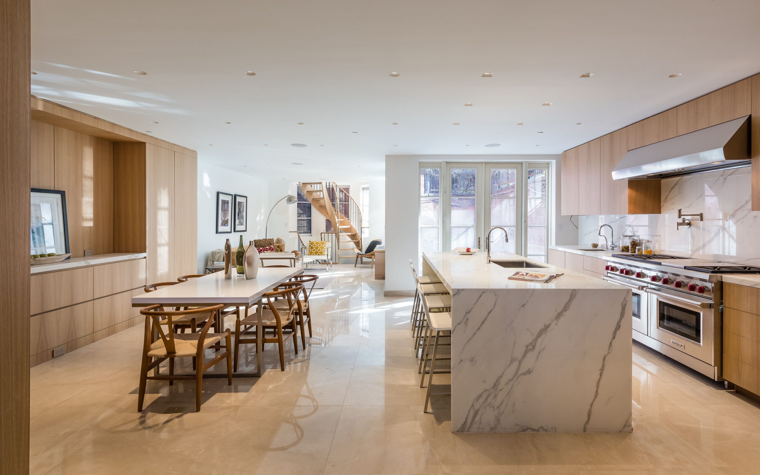
This summer has been a blur of beautiful brownstone stagings for studio D, and we’ve loved every minute of it. But 16 East 10th was an especially epic project, because, well…it’s an especially epic house. The 25-foot townhouse boasts an indoor lap pool, jacuzzi, wine cellar, an elevator that goes from the cellar level all the way to the sunny roof deck and more bathrooms than you can count. With nearly 10, 500 square feet, six stories and soaring 16-foot ceilings, you’re hard pressed to find a bigger home in Manhattan (and you definitely won’t find one with a bigger price tag, at least not in Greenwich Village). While all of this sounds incredibly glamorous and luxurious, a space this massive can be daunting in person.
Enter studio D. We were tasked with staging the garden floor (which had the kitchen, sunroom and family rooms), the parlor floor (which had the great/living room and dining room), the master suite (which also included two bathrooms, two dressing rooms and an adjacent office), and a bedroom on the penthouse floor. For both the parlor level and master suite level, the challenge was to design a layout that made the space feel comfortable and approachable, despite their vastness.
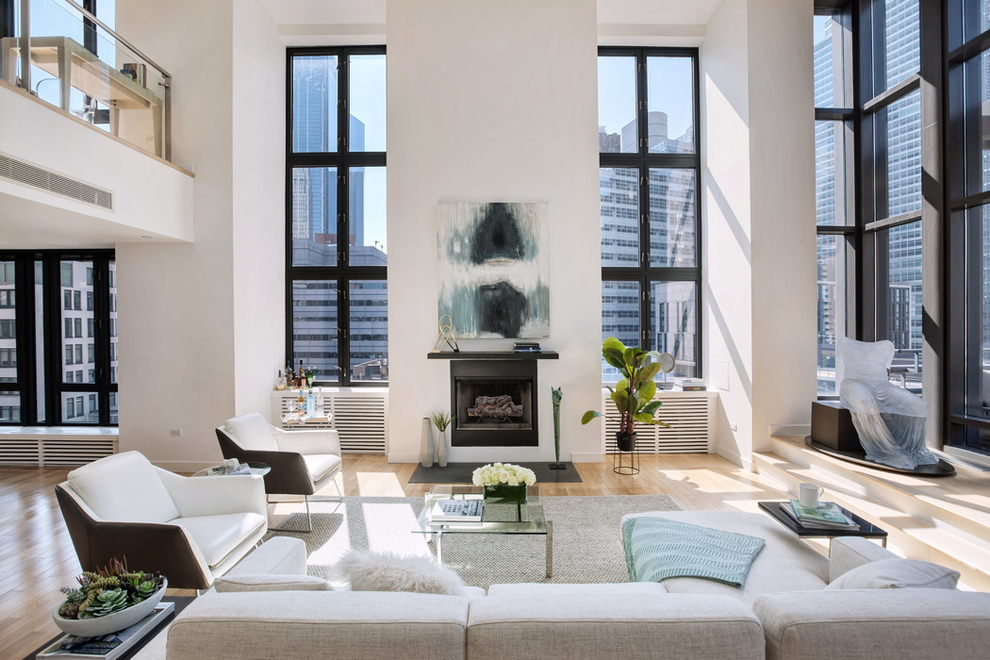
In the living room, we created two two distinct sitting areas, each with their own sofa, coffee table and pair of arm chairs. We used matching rugs that had subtle pattern and a slight silver sheen to up the glam factor. They, along with a sophisticated palette of grays and creams, helped to unite the two areas into one harmonious and (of course) incredibly chic space. We brought in a gorgeous wooden oval table for the dining room with light colored dining chairs so as not to overcrowd the space visually. W e hung a gallery wall and utilized the height of the room, drawing the eye up instead of from side to side. When we were finished, the room felt open and airy–not at all cramped.
Next, it was upstairs to the Master Suite and adjacent office. The bedroom was so large, even a king sized bed looked relatively small. Since regular night tables would look insignificant in a room this grand, we opted for two dressers instead. To further fill and warm up the room, we added a seating area at the end of the bed, complete with sofa and arm chairs. Large, modern canvas art not only added color and texture to the walls, it gave the bedroom a regal, almost gallery-like feel.
Unlike the rest of the house, the penthouse floor had an average 8 foot ceiling height, which, relative to the rest of the house, felt a little low. We brought in a sleek platform bed with a low profile and two shorter end tables which gave the room a cool, more relaxed feel. Even more notable than the ceiling height, the bedroom’s width was that of the entire house–25 feet! Needless to say, we had plenty of room for a seating area at the other end of the room. We went with furniture with more masculine lines and gray tones as we envisioned the space as the ultimate bachelor pad.
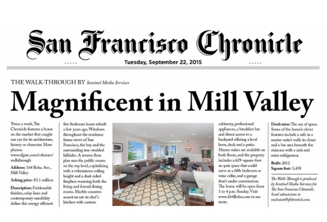
When we finished this six-story staging, our team was tired, but proud of a job well done. We were of course ecstatic to see our work featured in the Wall Street Journal and Curbed days later, but the real satisfacation came when we learned the property sold for asking price in just a little over a month!


